

openpyxl グラフで色を変更できる箇所
| 項目 | 色変更の可否 |
|---|---|
| 系列の色(棒・線など) | ✅ 可能 |
| 折れ線の色(線の太さも可) | ✅ 可能 |
| プロットエリア背景色 | ✅ 一部対応 |
| グラフ全体(Chart Area)の背景色 | ❌ 非対応 or 不安定 |
本記事では、系列・折れ線・プロットエリアの背景色について、それぞれの色を変更する方法をわかりやすく解説します。
色の変更方法に共通すること・注意点
- 色はすべて 16進数のRGBコード で指定する
- 色を変更する対象によって アクセスするオブジェクトが異なる
- 色を変更した後は、wb.save()を実行しないとファイルに反映されない
系列の色を変更する方法
Excel グラフで使われる「系列」とは、グラフ上で表示されるデータのひとまとまりのことを指します。
ここでは、openpyxlを使ってこの系列ごとの色を変更する方法をわかりやすく解説します。
基本の考え方
- Series:系列を表すオブジェクト
- graphicalProperties.solidFill:系列の塗りつぶし色を指定
棒グラフの系列の色を変える
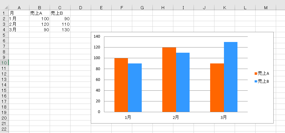
from openpyxl import Workbook
from openpyxl.chart import BarChart, Reference

# ワークブックとシートを作成
wb = Workbook()
ws = wb.active

# データを追加
data = [
    ["月", "売上A", "売上B"],
    ["1月", 100, 90],
    ["2月", 120, 110],
    ["3月", 90, 130]
]
for row in data:
    ws.append(row)

# グラフを作成
chart = BarChart()
data_ref = Reference(ws, min_col=2, min_row=1, max_col=3, max_row=4)
cats_ref = Reference(ws, min_col=1, min_row=2, max_row=4)
chart.add_data(data_ref, titles_from_data=True)
chart.set_categories(cats_ref)

# 系列ごとに色を設定
chart.series[0].graphicalProperties.solidFill = "FF6600"  # 売上A → オレンジ
chart.series[1].graphicalProperties.solidFill = "3399FF"  # 売上B → 青

# グラフをワークシートに追加
ws.add_chart(chart, "E5")

# ファイル保存
wb.save("chart_with_colors.xlsx")
折れ線グラフの線の色を変更する方法
ここでは、openpyxlを使って折れ線グラフの線の色を変更する方法を、解説します。
基本の考え方
openpyxl では、折れ線のスタイルはgraphicalProperties.lineを通じて設定できます。色だけでなく、線の太さやスタイル(実線・点線など)も制御可能です。
- LineChart:折れ線グラフを作成するクラス
- graphicalProperties.line:線の見た目を指定するプロパティ
- solidFill:線の色を指定
折れ線の色を変更する

from openpyxl import Workbook
from openpyxl.chart import LineChart, Reference
from openpyxl.drawing.line import LineProperties

# ワークブックとシートを作成
wb = Workbook()
ws = wb.active

# データを追加
data = [
    ["月", "売上"],
    ["1月", 100],
    ["2月", 120],
    ["3月", 90]
]
for row in data:
    ws.append(row)

# 折れ線グラフを作成
chart = LineChart()
data_ref = Reference(ws, min_col=2, min_row=1, max_row=4)
cats_ref = Reference(ws, min_col=1, min_row=2, max_row=4)
chart.add_data(data_ref, titles_from_data=True)
chart.set_categories(cats_ref)

# 線のプロパティを設定(色と太さ)
line = LineProperties()
line.solidFill = "FF0000"  # 赤色
line.width = 20000

# 系列に線の設定を適用
chart.series[0].graphicalProperties.line = line

# グラフをワークシートに追加
ws.add_chart(chart, "E5")

# ファイル保存
wb.save("line_chart_colored.xlsx")
プロットエリアの背景色を設定する方法
Excel グラフにおける「プロットエリア」とは、実際にデータ(棒や折れ線など)が表示される領域を指します。
ここでは openpyxl を使ってプロットエリアの背景色を設定する方法をわかりやすく解説します。
基本の考え方
- プロットエリアの装飾は chart.plot_area.spPr を使って指定します
- spPr は背景色・線などの見た目を担当します
プロットエリアに色を設定
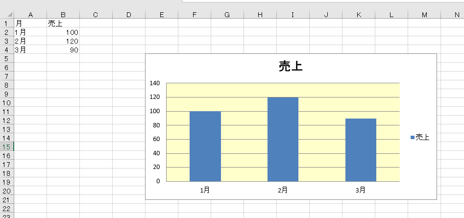
from openpyxl import Workbook
from openpyxl.chart import BarChart, Reference
from openpyxl.chart.shapes import GraphicalProperties

# ワークブックとワークシートを作成
wb = Workbook()
ws = wb.active

# データを追加
data = [
    ["月", "売上"],
    ["1月", 100],
    ["2月", 120],
    ["3月", 90]
]
for row in data:
    ws.append(row)

# 棒グラフを作成
chart = BarChart()
data_ref = Reference(ws, min_col=2, min_row=1, max_row=4)
cats_ref = Reference(ws, min_col=1, min_row=2, max_row=4)
chart.add_data(data_ref, titles_from_data=True)
chart.set_categories(cats_ref)

# プロットエリアの背景色を設定
chart.plot_area.spPr = GraphicalProperties(solidFill="FFFFCC")  # 薄い黄色

# グラフをワークシートに追加
ws.add_chart(chart, "E5")

# ファイルを保存
wb.save("plot_area_background_color.xlsx")
公式ドキュメント

openpyxl.chart.shapes module — openpyxl 3.1.4 documentation
openpyxl.readthedocs.io

コメント